

UTA A+AH WEBSITE
/ art and art history department dedicated to providing and encouraging the understanding and expansion of knowledge in visual arts, art history, and art education /
Heading the web design for the art and art history department, I kicked off the design process with a competitive analysis, collegiate research, and user feedback. After much ideation to solve key issues, I created a branded modular site featuring color-coded student level pages, refined navigation, and areas of study footers for smooth exploration.

Problems
○ Outdated and non-branded look
○ Missed opportunities using digital real estate
○ Overwhelming navigation and user experience
○ Lack of visual direction and hard to find needed information
○ Non-responsive functionality/layout

My Role + The Team
As the department's graphic designer, I was to design the new departmental website plus various digital and print requests like flyers, event banners, posters, and more.
Department Chair: Robert Hower
Developer: Cosme Olivas

THE PROCESS
a combination of competitor websites, internal feedback, and industry standard implementation

Research
Competitive analysis: Rocky Mt College of Art + Design, Art Institute of Chicago, Cranbrook Academy of Art, and more
Current UX standards (margins, hierarchy, column-and modular-based layout, and navigation)
Data around student and faculty needs, pain-points, and feedback

Concept
Household Recalibration
Aligning with the UTA’s official color palette allowed the expansion to:
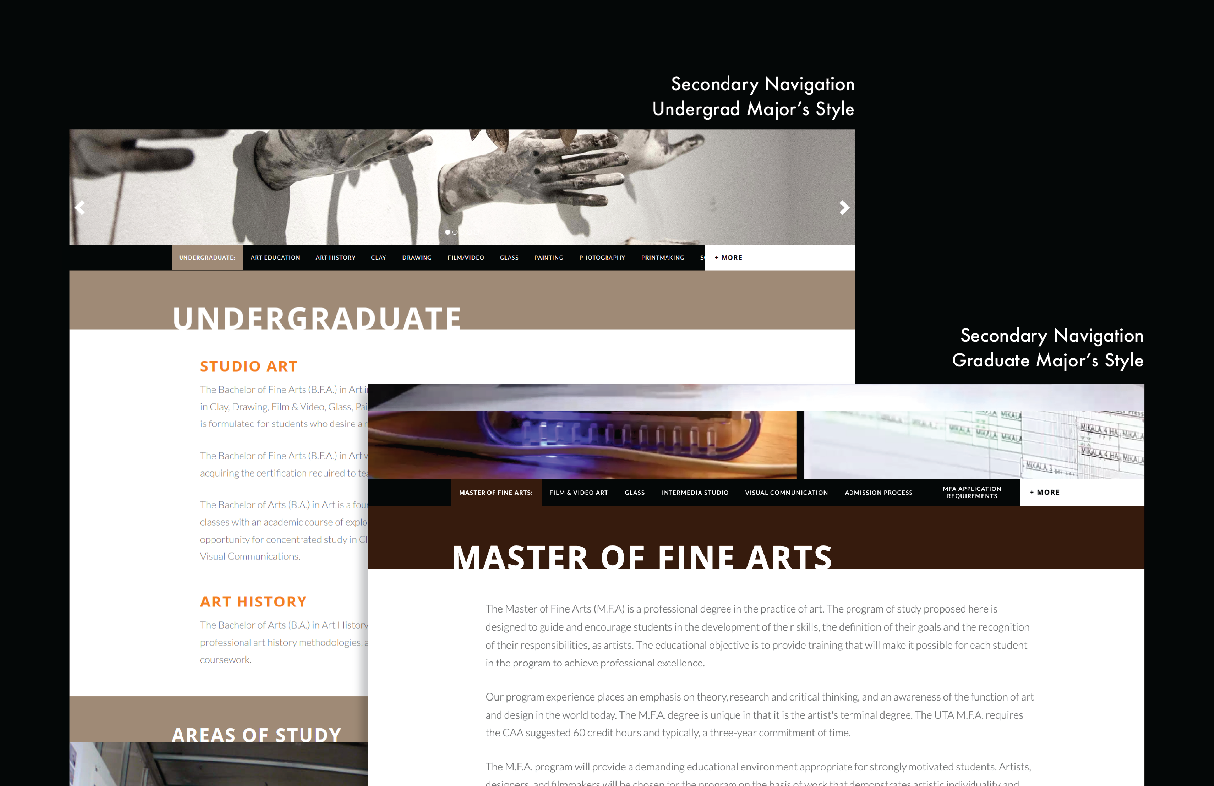
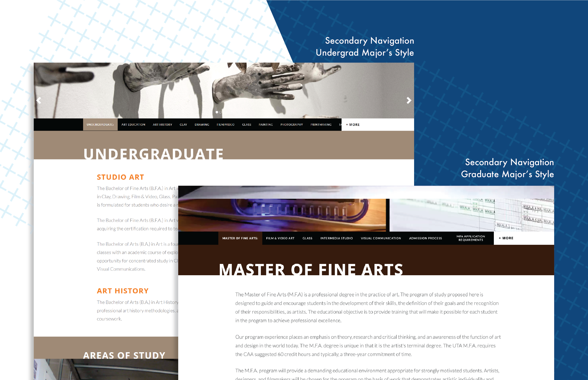
○ implement a system where visitors could dictate the difference between sections and student levels
○ update navigation allowing links to other majors and extended menus to related pages
○ create a content-specific design system for scanning for easy scanning


The Final Product
With an inspiration of simplicity and modular design a simple user friendly site was created to engage visitors and students to explore the department's website. By applying the brand of UT Arlington and creating a system with their main colors it made it much easier to navigate. Site sections and touts were made separately then, depending on the page, combined together to form full pages. Small details like hovers and image expansions were also added and refined. Explore the new site live at www.uta.edu/art.
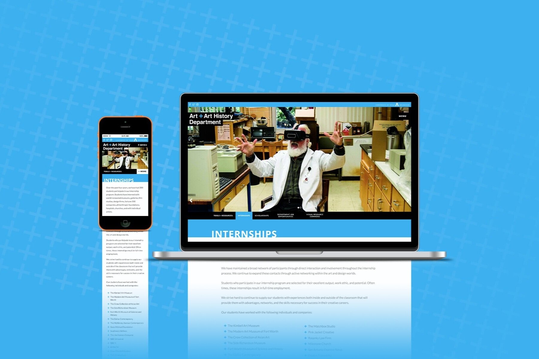
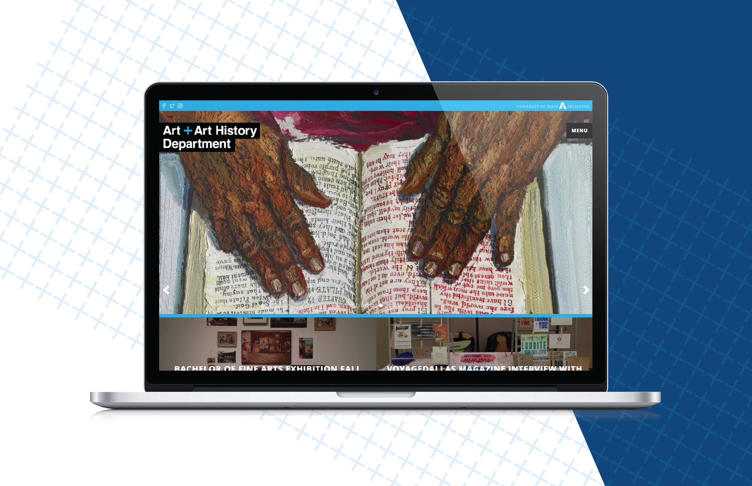
HOME PAGE // Rotating header images, sub section modules and links.
DRAWING // Faculty highlight, course listings, and previews of student work. Also includes shortcuts to other undergrad majors.
IMPORTANT DOCUMENTS // Simple module hub of downloads of all paperwork students/faculty may need during their educational career.
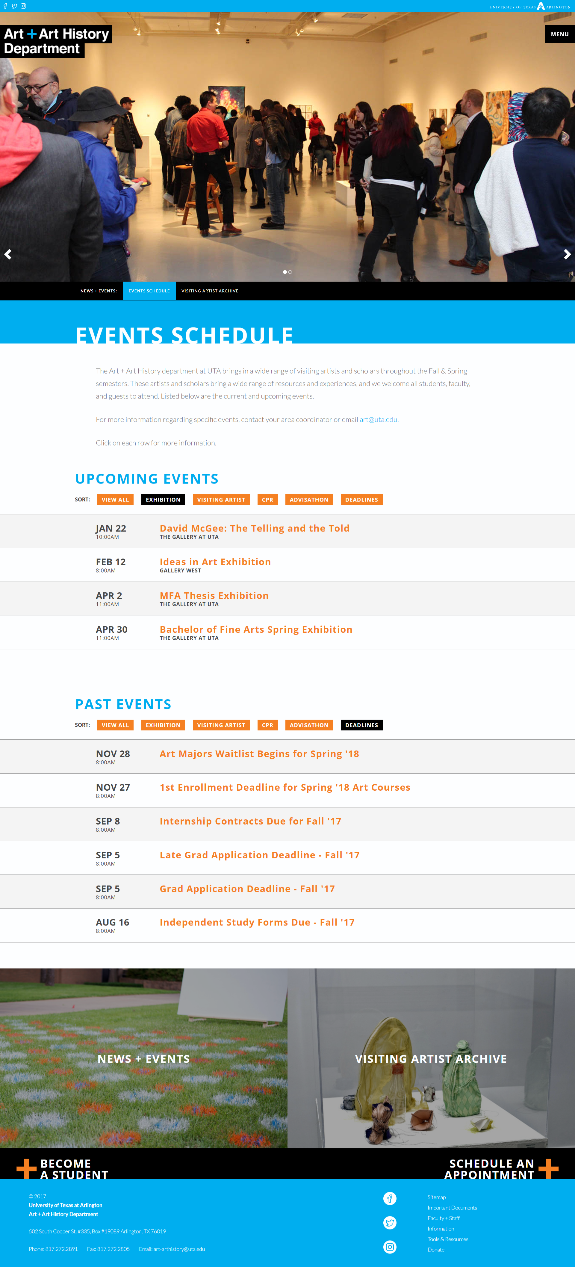
EVENTS // Base for all events related to the department with tags to sort from, easily accessible drop-downs and touts leading to other relevant pages.