tEXAS WOMEN’S FOUNDATION WEBSITE
/ a website design built for TWF to expand outside Dallas and transform Texas /
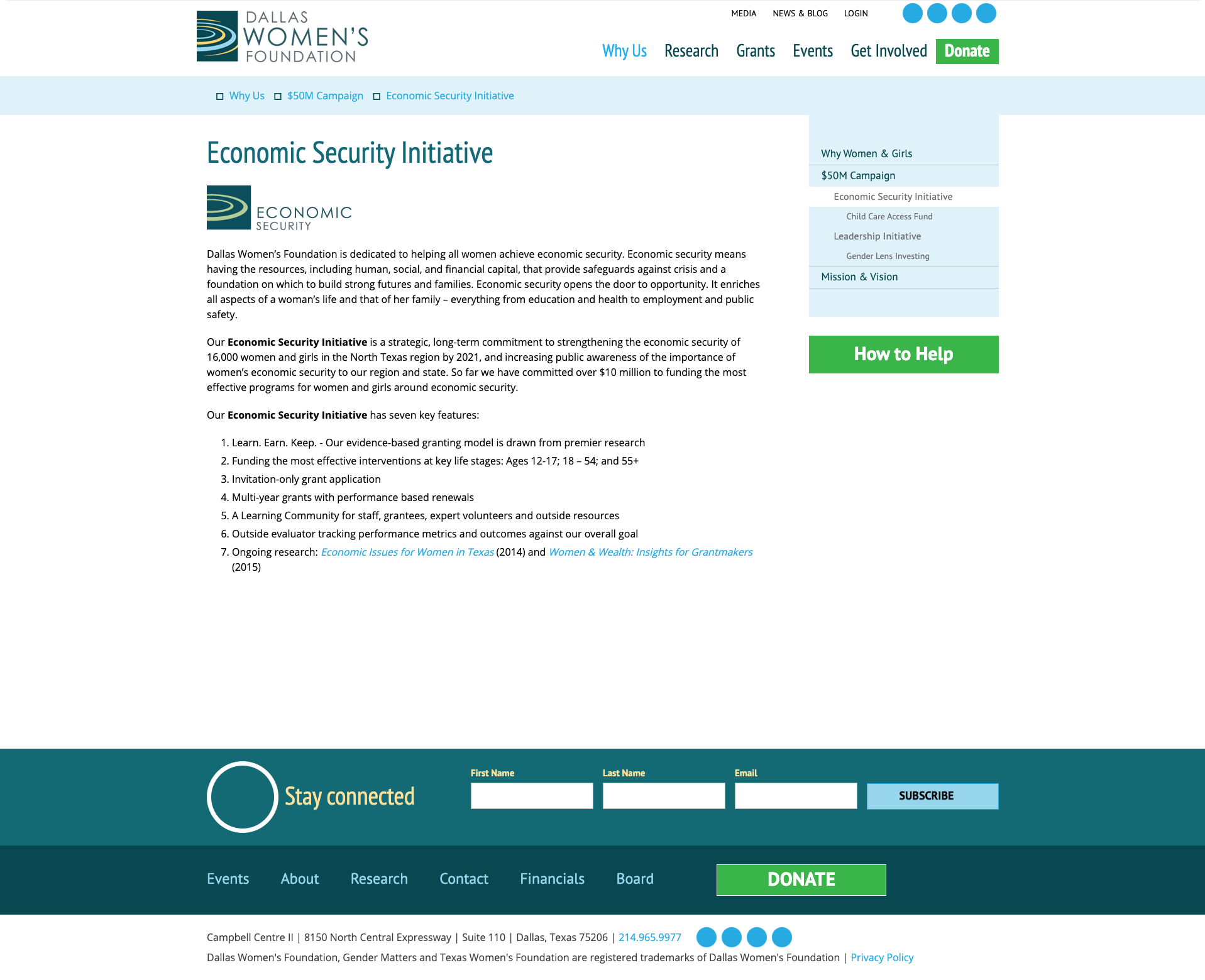
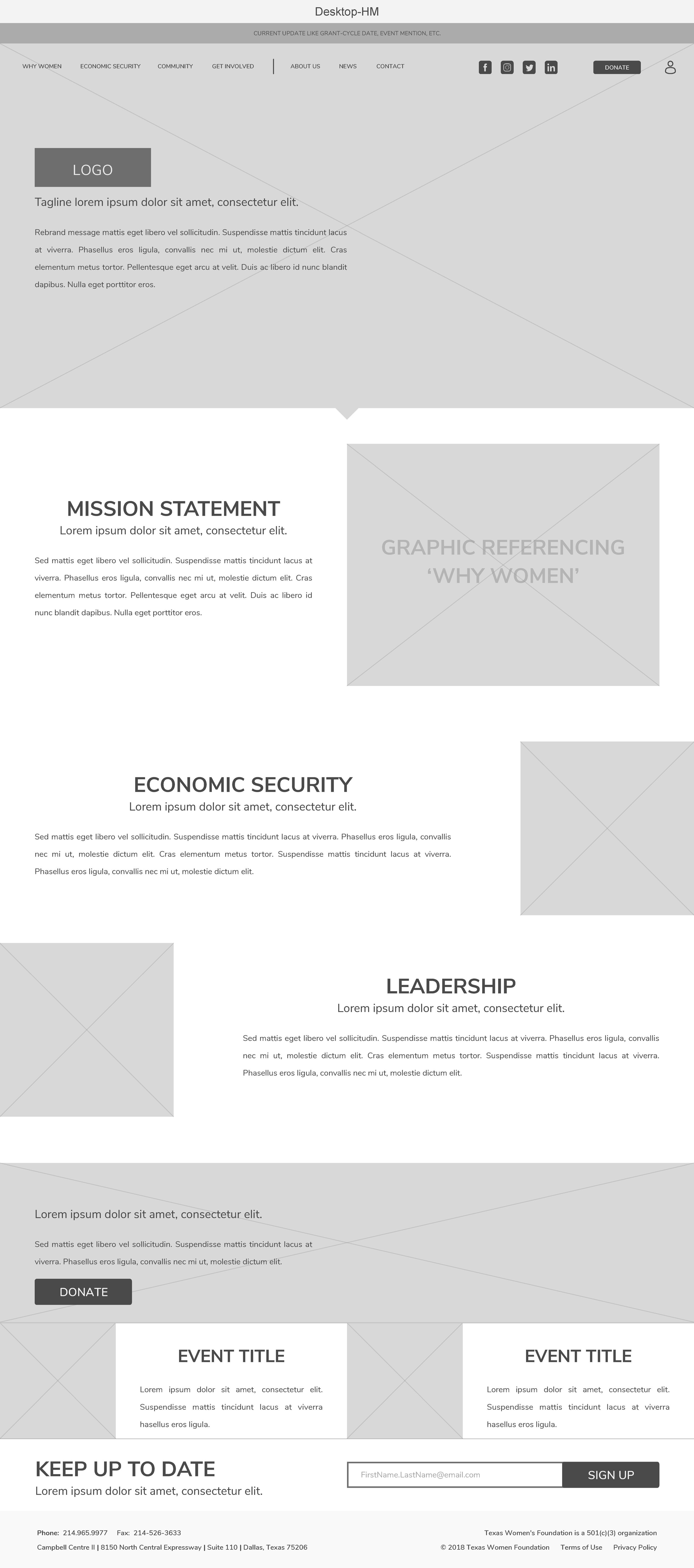
Formerly known as Dallas Women’s Foundation, Texas Women’s Foundation needed an updated website to reflect their new look and their foundation expansion from solely Dallas to Texas as a whole. To ensure old site issues were addressed and new needs acknowledged, complementary navigation menus and page tabs were designed based on a newly condensed site map. By visibly and structurally providing hierarchy, we address the main issue of user flow, allowing visitors to find exactly what they need easier. Visit the website live at Texas Women’s Foundation.
Problems
○ 5 different navigation menus (including footer)
○ Awkward usage of digital real estate
○ Pages with various sections with different background colors or plain white with a lot of and only copy
○ Lack of visual direction and inconsistent layouts
○ Ineffective responsive functionality/layout
My Role + Team
As the lead UI/UX designer, I was tasked with updating the site UI with provided branding guidelines and designing/reorganizing the expansion of the new TWF website.
Creative Director: Keisha Whaley, Brass Tacks Collective
Project Manager: Cece Rockwell, Brass Tacks Collective
The Process
a brand update/refresh, internal feedback, and industry-standard implementation
Research
○ Benefits of making a responsive site and how people consume content from LDWW
○ Information architecture of complex sites
○ Responsiveness and effective use of digital real estate
○ Foundation top priorities and content hierarchy
Concept
Setting rules for current and future expansion was extremely important. That meant creating an organized hierarchy of pages (thank you site mapping), an efficient navigation experience, and clear visual expectations. TWF’s new branding palette was also used to establish rules for main navigation/child pages through header design, active/inactive states, and graphics like their interactive research map.


