

NCH Corporation Portal
/ simplify and organize a customizable layout for an company portal /
The internal workings of a company are crucial when it comes to business, company culture, and interacting with customers. Keeping this in mind, an accompanying brand extension paired with a simple modular layout was formed. This especially allowed the portal to easily stack as a responsive application. Additionally, the brand extension was essential in creating two main pages (default: home and secondary: departmental) and assisting with the complexity of the menu navigation.

Problems
○ Lack of NCH branding
○ Awkward usage of digital real estate
○ Overwhelming and complicated navigation
○ Lack of visual direction and inconsistent layouts
○ Ineffective responsive functionality/layout

My Role + The Team
As the lead UI designer, I revamped the layout to create a modular system for page customization/responsiveness and extended the branding palette to complement it.
Creative Director: Keisha Whaley, Brass Tacks Collective
Project Manager: Cece Rockwell, Brass Tacks Collective
The Process
a combination of competitor websites, internal feedback, and industry-standard implementation

Research
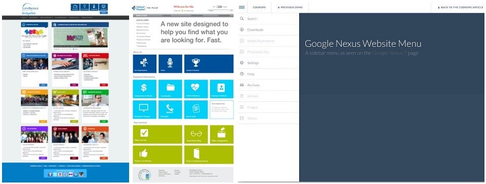
○ Other branded portals and complex menus
○ Color theory study to find the best colors to complement the NCH Corporation branding
○ Portal responsiveness from desktops to tablet screens
○ Modular systems and column structures best suited for a modular layout

The Concept
A 21st Century Update
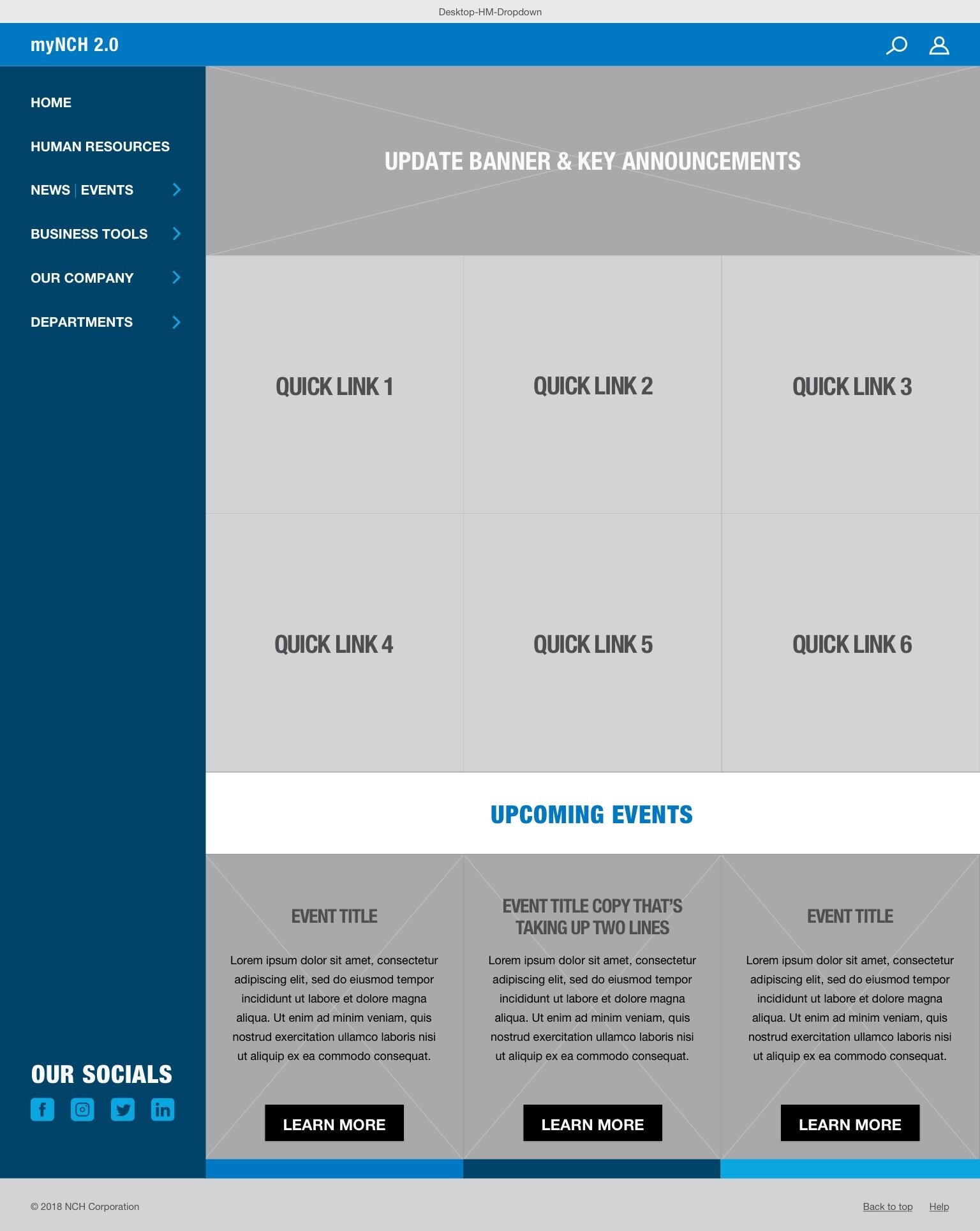
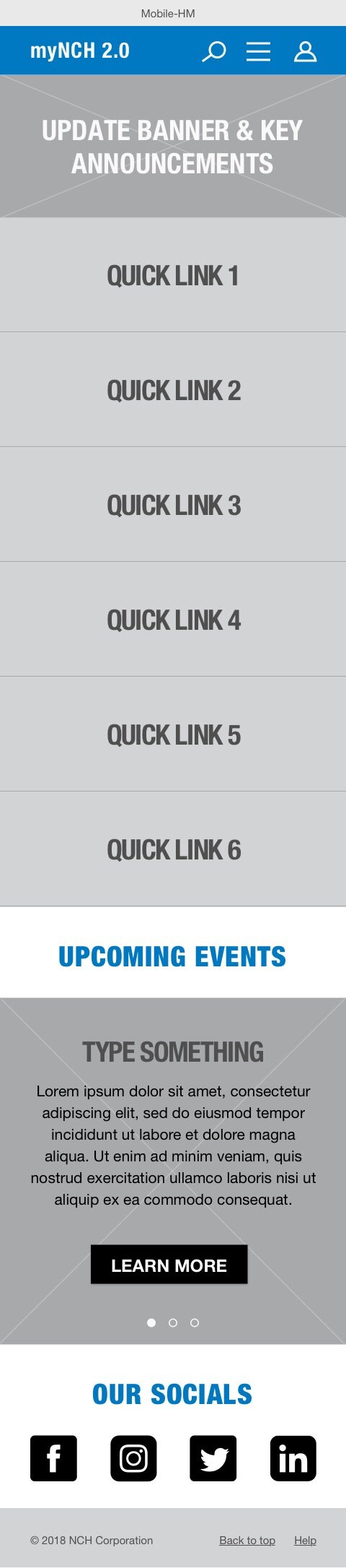
The highest priority was to give this platform a responsive customizable space that could be modified. Revamping their space into industry standards solved a lot of the user pain points including navigation and recognizing the difference between department pages and different sections of the site.


The Final Product
Through a modular facelift and a brand extension, a clean user-friendly site was created to simplify the platform layout for ease of use. This system also allowed different departments to customize their own homepage without breaking away from the NCH Corporation brand. By extending the color palette it opened up the ability to build a color-implemented hierarchy in the navigation. To create a set of rules and clarity, style tiles for the modular sections were also created with complementary icons, font styles, and a detailed breakdown of the navigation.
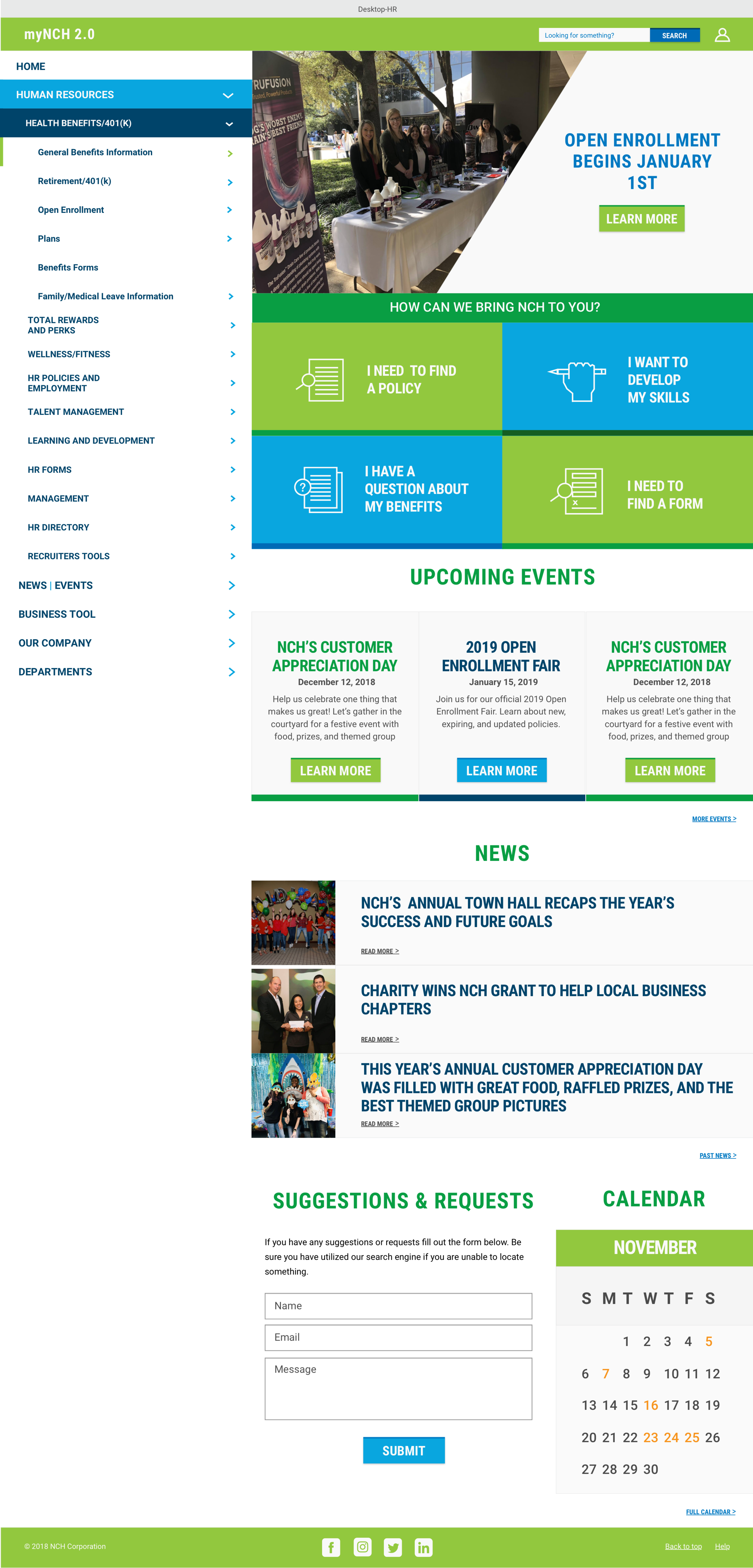
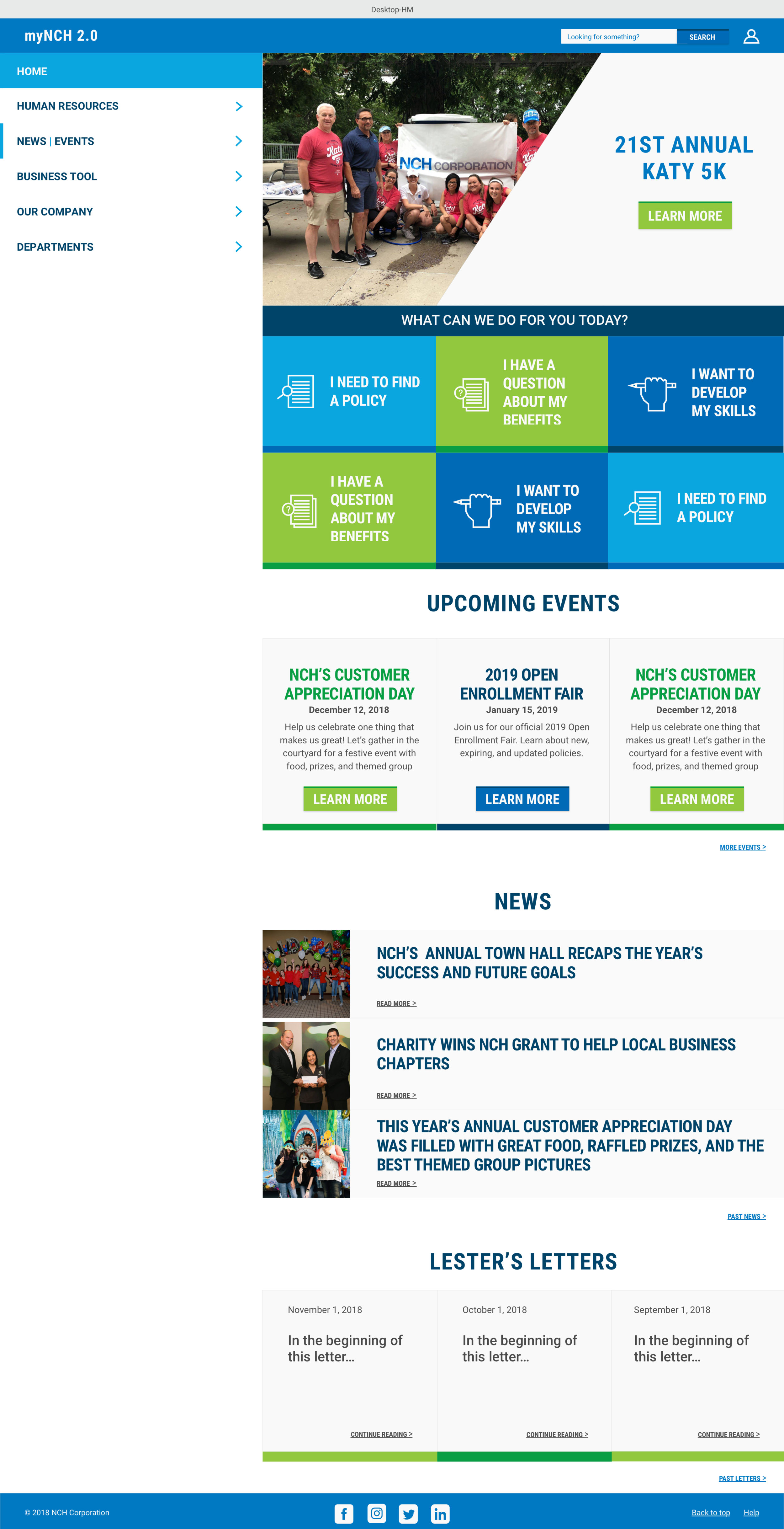
Default layout for the home page and an internal department page.
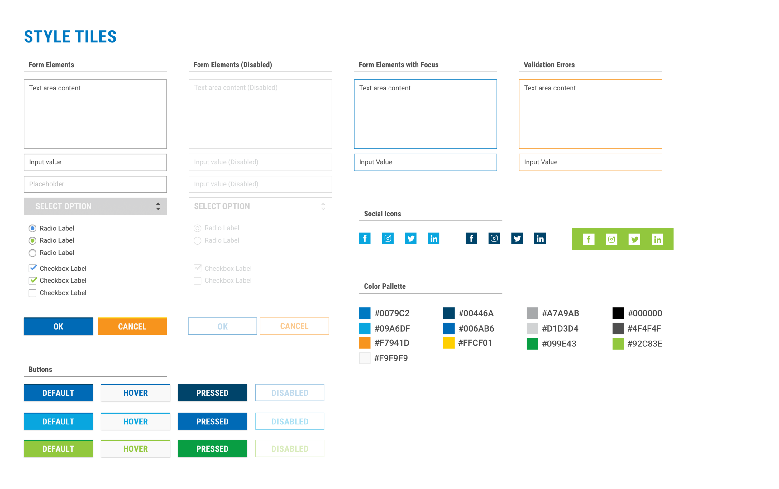
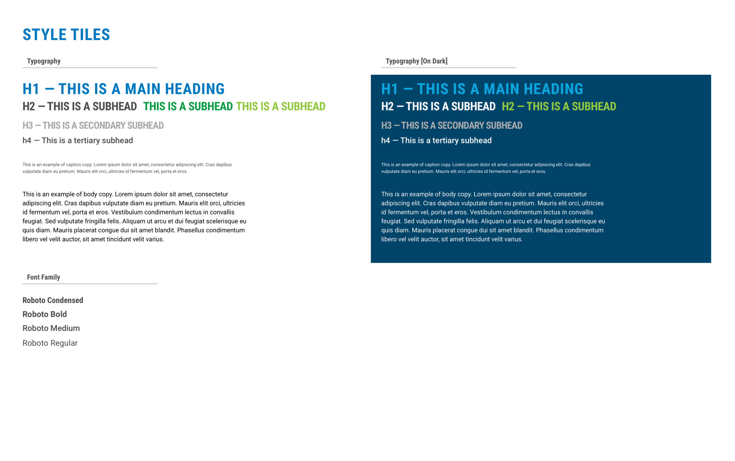
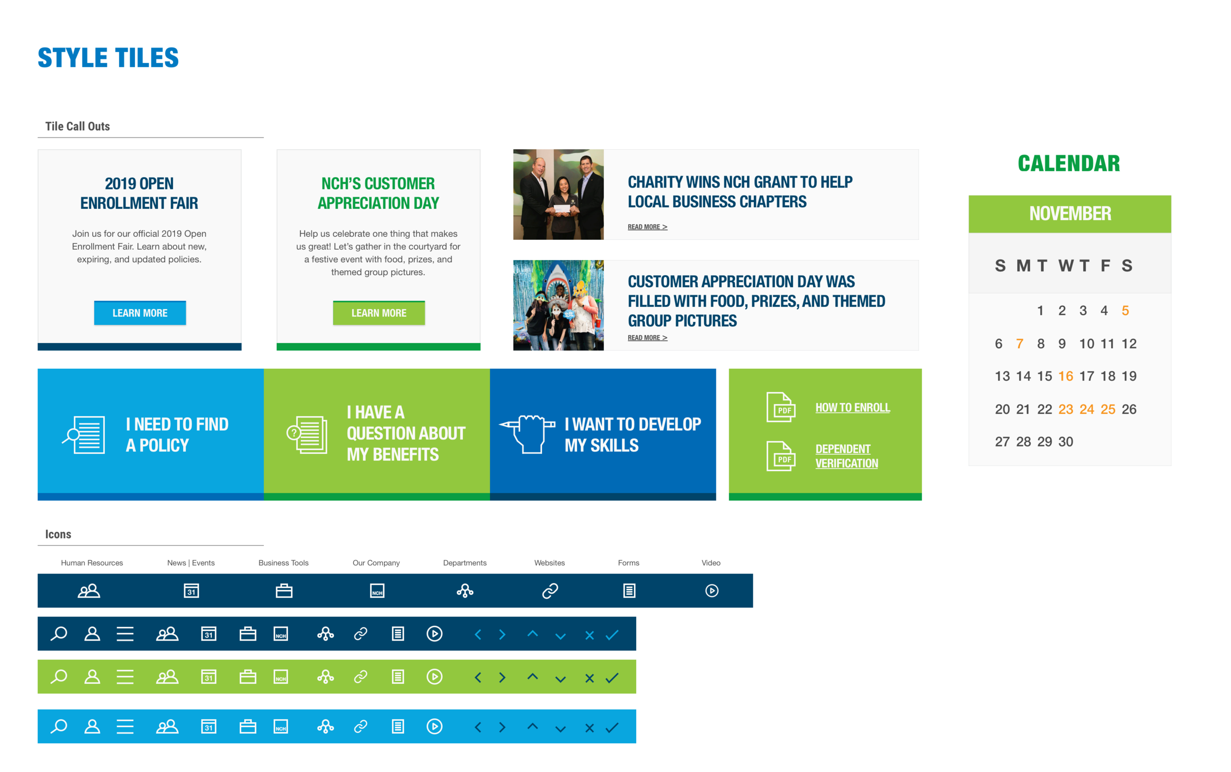
Style tiles for the typography, extended color palette, and various UI design elements like buttons, icons, calendars, and event/news postings.

Visual hierarchal breakdown of the side navigation.